Olé Torobo
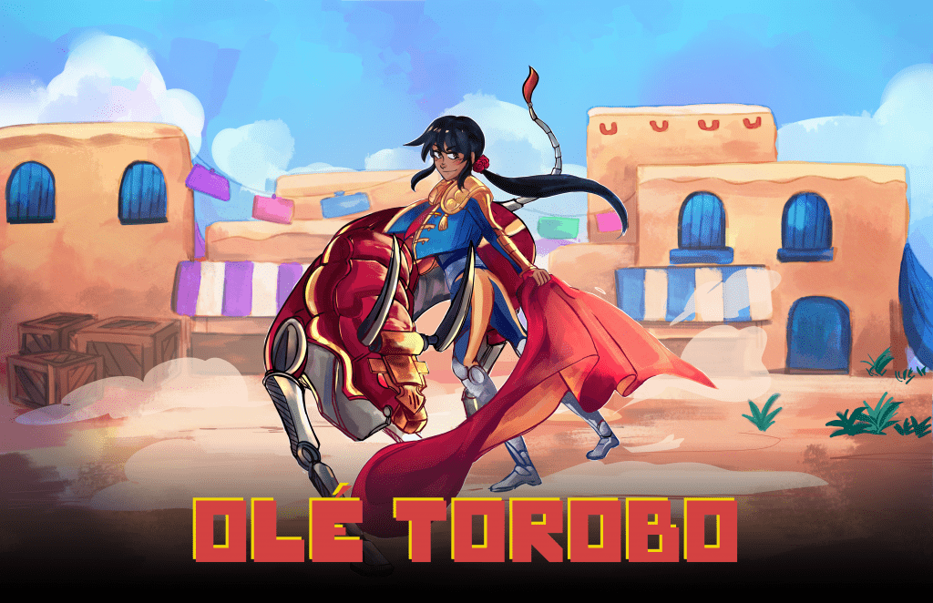
Olé Torobo is an isometric action game where you use positioning and well-timed dodges to lure robotic bulls into hazards and breakable objects to defeat them. The robotic bulls are called “torobos”, which is a word created by combining the spanish word for bull (toro) and robot.
Project Information
Type: Game Design, UX Design
Tools: Adobe XD, After Effects, Affinity Designer, Miro, Unity
Team Size: 6
Platform: PC & Mac
Background
The initial idea for the game came from me experimenting with a Breakout clone in Unity. In this prototype, instead of trying to move the paddle to hit the ball, you are inside an enclosed space where you must dodge it as it ricochets around you. From there, I reskinned the project over the weekend by turning the paddle into a matador, and the ball into a robotic bull. You can see the evolution of the idea in the video shown here. Afterwards, I put the idea in my backlog as I ended up getting preoccupied with other work and projects.
A year later I joined Gameheads and decided to pitch the idea so I could work on it as one of our summer projects. I created a simple pitch deck and shared the original concept and prototypes with a few folks, and we decided to team up for the next 10 weeks and see how far we could push the idea!
Project Goals
Collaborate with a team and practice delegating tasks
Despite coming up with the intial idea on my own, I wanted to practice collaborating with a team and delegating various aspects of the game’s design instead of trying to take it on all myself.
Explore more of the UI/UX design pipeline
For this project I was tasked with leading the charge on UI/UX, so I wanted to make sure to explore more of the development pipeline than just ideation and prototyping.
Process
In our small team of 6, I took on the role of UI/UX designer, as well helping out with some basic game and level design work.
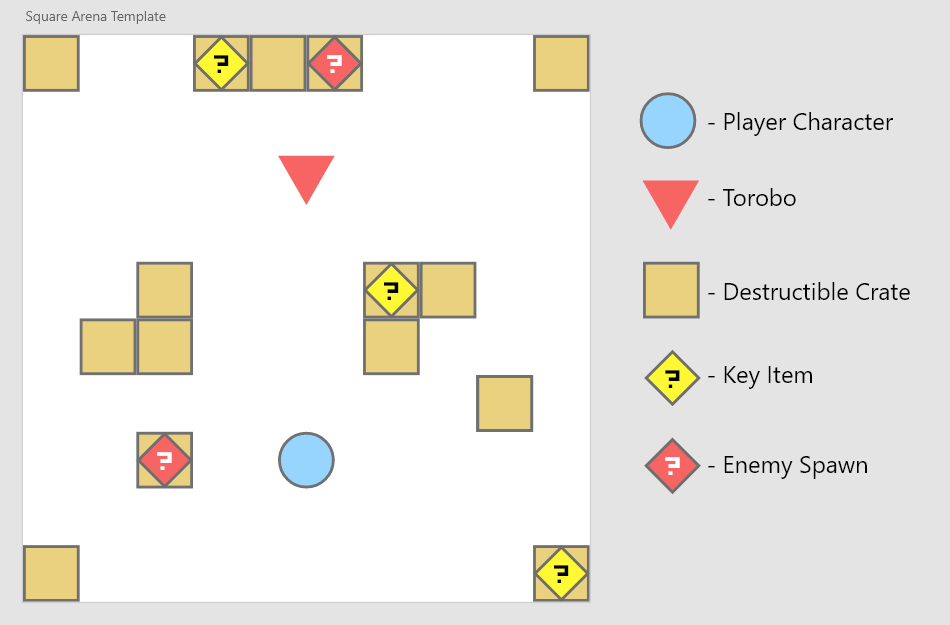
For game design, I worked on prototyping some of our moment-to-moment gameplay using Adobe XD to get a better sense of timing and game feel as objects move around the level. You can see this prototype with the assets shown here, or go through it yourself by clicking the button below:
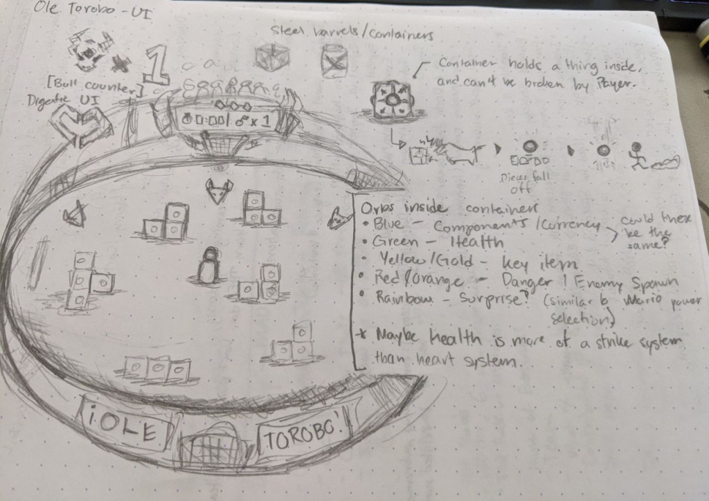
As for the making the UI for the project, I went through my usual process of first sketching out some concepts on paper and then making the higher fidelity assets in Affinity Designer. Once those were completed, I exported the assets, added them to our Unity project, and pushed the changes through GitHub.
From here, I started working on the layout, animation and functionality of the UI within Unity. A trick I like to use is exporting simple UI elements in grayscale in order to be able to tweak their color in-engine and tryout different combinations quickly. Once the layout felt in a good place, I started working on adding functionality to the buttons via C# scripting.
I worked on a simple button script that would alter the button’s behavior on hover and on click, as well as load a new scene when clicked. Using this script in tandem with a tweening library called DOTween, I was able to add animations to the various UI elements of the game in an efficient way. I then worked with our programmer to connect all the pieces of the UI and get everything working properly.
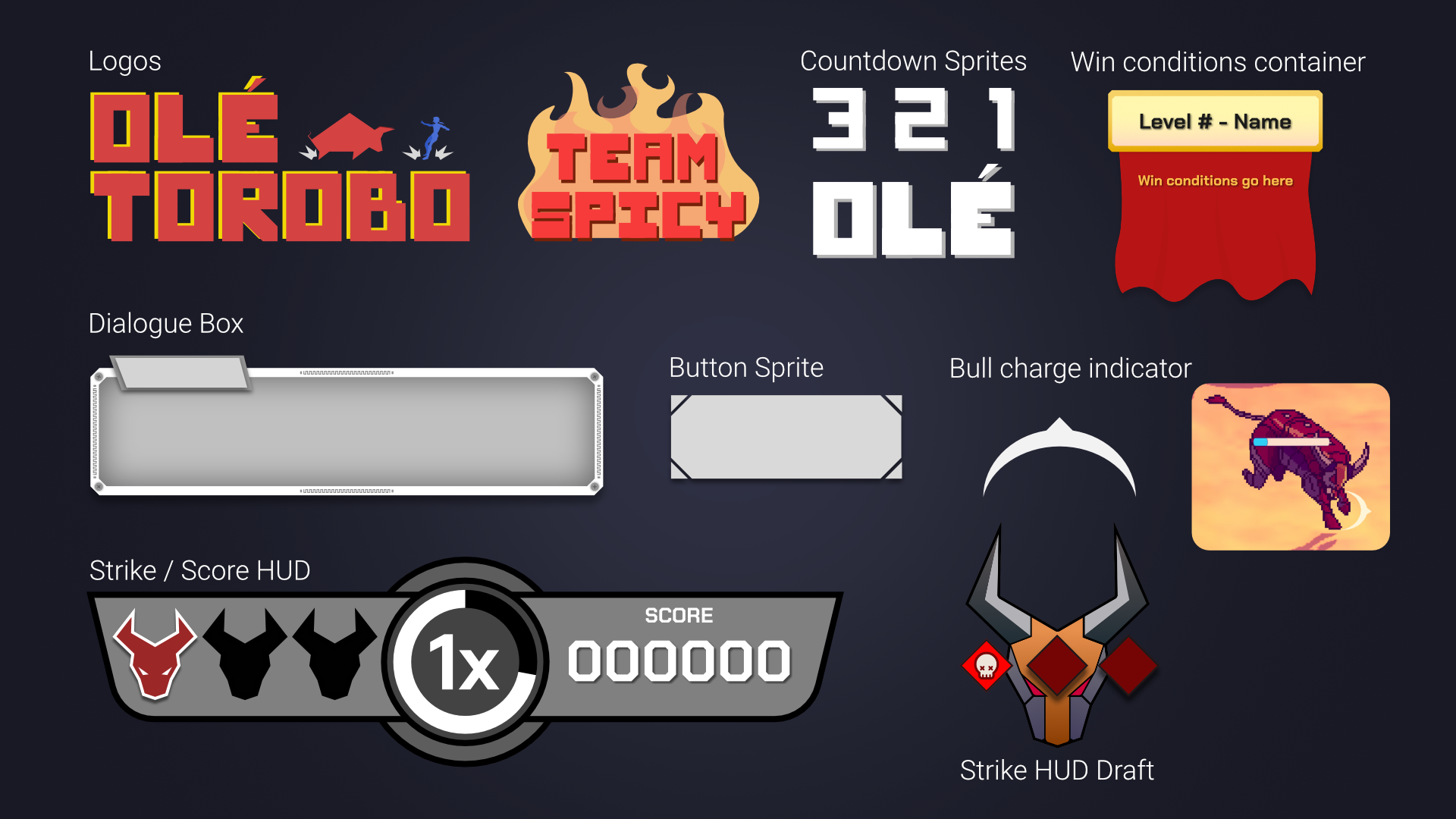
You can see the evolution of the UI by looking at the different images and videos below. The UI component that I enjoyed working on the most was our Strike / Score HUD. On the right it shows your score value, while at the center it shows a score multiplyer and radial bar timer. Each time you perform a perfect dodge in the game, the value of the multiplyer increases by one. On the left you have some slots for Strike markers. Essentially, if you get hit by a Torobo three times, you lose. I’m really happy with how we were able to condense all of this information into single element on the screen!
Takeaways
I like to design, ideate, and prototype
While being able to explore more of the UI/UX pipeline by practicing in-engine work was great, I feel that my forte lies in the ideation and prototyping of interesting UI and interaction systems.
People make games
It was really interesting to see how the make up of our team influenced and changed what the game ended up being like! Having the ability to brainstorm as a group took the game in a direction that I could never have imagined on my own. While it is a very different game than the one I had first imagined, I’m happy with what we ended up with and am grateful to have worked with such a great team! The video here shows a short trailer for what the final version of Olé Torobo looked like at the end of the summer program.


