Pokémon Strikers
Pokémon Strikers is a personal project where I wanted to explore what the design for a Pokémon soccer game could look like! Inspired by the likes of Super Mario Strikers, I worked on wireframing and prototyping what I imagined the user experience could be.
Project Information
Type: UX Design
Tools: Adobe XD, After Effects, Affinity Designer
Team Size: 1
Background
More than anything this was an exploratory project where I wanted combine two of my favorite things; Pokémon and soccer. One of my favorite games is Super Mario Strikers, and I really enjoy how it presents soccer in a unique way with an iconic cast of characters!
I felt that Pokémon could work extremely well for this sort of game since they already have iconic characters with special moves that can be adapted to become signature moves in soccer. Additionally, by bringing over their stats from the mainline games, we can match different Pokémon to various roles on a traditional soccer team (offensive vs defensive players).
Project Goal
Explore the UI/UX design of a soccer themed Pokémon game
I wanted to go through the ideation, concept and prototyping process while combining the elements of one of my favorite franchises with elements from my favorite sport!
Process
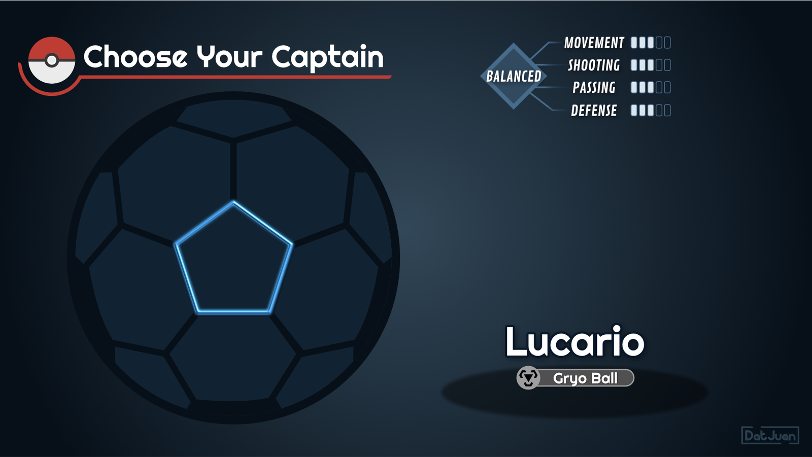
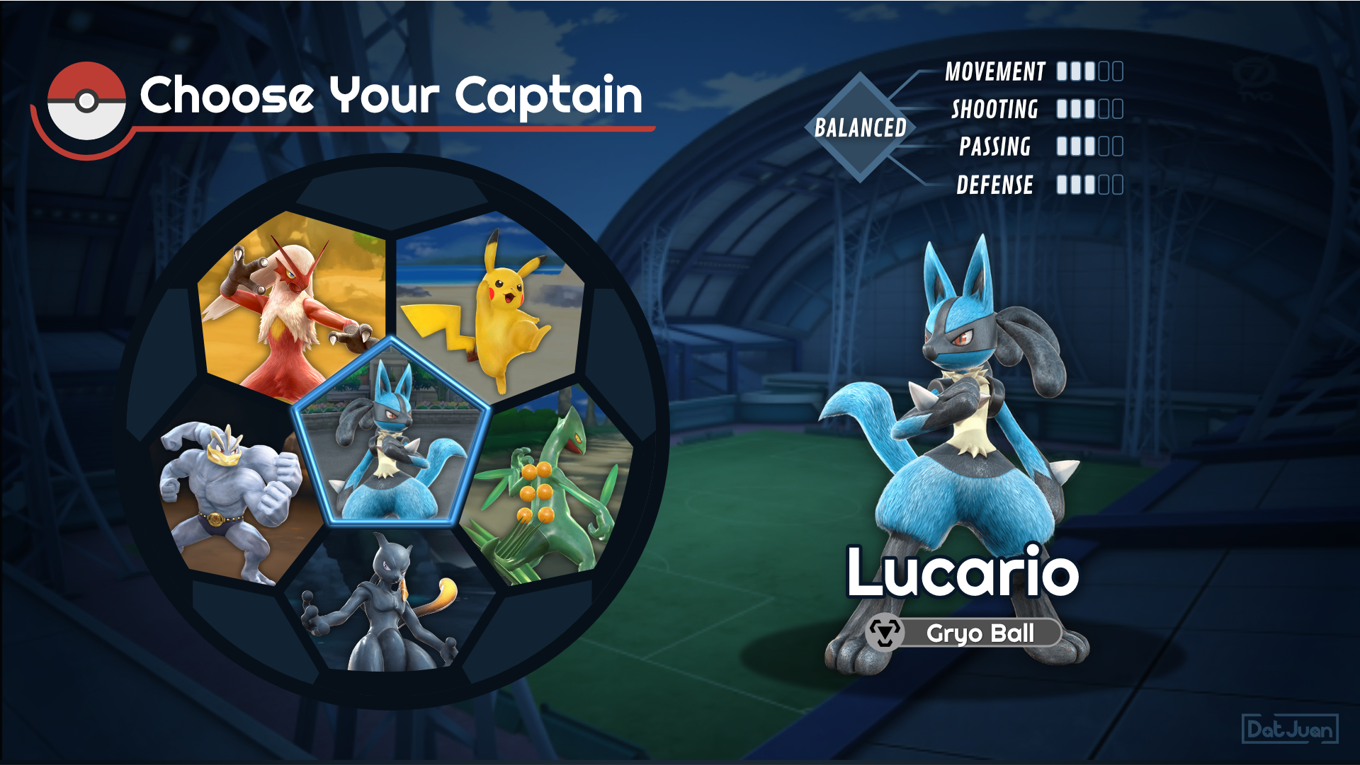
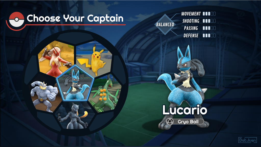
I started off by sketching out a concept piece, as well as a simple wireframe that incorporated different elements of soccer into the UI (ie. ball, goal post, bench, etc). My favorite element was the character selection menu inside of the ball, so I decided to explore that further!
The images below show what my design looks like with and without external assets by moving the slider back and forth.


This first video shows what clicking through different characters on the prototype looks like. I started by concepting the design on paper, making the more complex assets in Affinity Designer, and then moving those assets into Adobe XD to prototype interactions.
You can check out the character selection prototype by clicking on the button below!
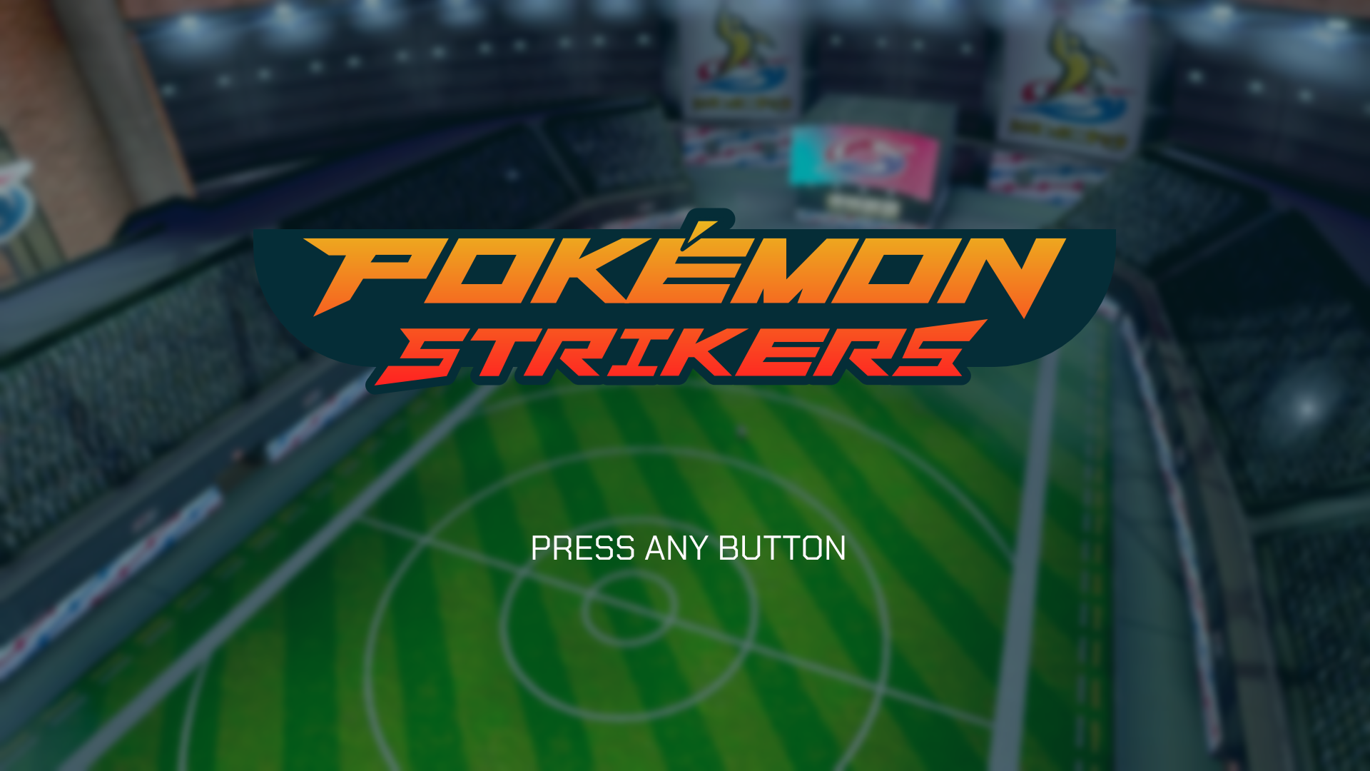
This second video showcases a short title screen animation that I made for the project! I created the Pokémon Strikers logo in Affinity Designer and then brought it into After Effects to add some motion and sound effects.
Takeaways
Considerations for expanding upon the UI
While making this soccer ball themed character selection menu was fun, there are certain considerations I would need to keep in mind if this menu needed to be expandable. For example, if players can unlock new characters, how would the menu change? Could I add more slots inside the current ball container, or would it make more sense to rotate the ball to create another screen with 6 additional slots? This was outside of the scope for this personal project, but I’d love to experiment with different approaches for trying to answer this question!
Getting constructive feedback from fellow designers is incredibly helpful
While working on this project, I shared iterations of the prototype with the awesome folks of WeCanFixItInUI, a community dedicated to UI & UX in the Video Games industry. With their help and suggestions, I was able to improve upon the design and make a better prototype overall!


